Day Trading Forex Live – Advanced Forex Bank Trading Strategies

Introduction to Technical Analysis

To reiterate what we have already discussed in earlier chapters, technical analysis is the study of markets using historic price behavior. Some people refer to traders who prefer this method as “Chartists” as it provides a trader with a graphical representation of the market price behavior over time. 

How to Read Price

There are three types of charts that display market prices in the forex market, the bar chart, the candlestick chart, and the line chart.

Bar Charts

The bar chart is a detailed charting style that shows the entire progression of the price during a specific period of time. This could be a 1 Minute Bar chart all the way to a monthly time frame. Assuming you were on the daily time frame, each bar would represent a single day’s move. A single bar is displayed below:

It begins with a horizontal dash, which represents the opening price. As the price moves the dash on the right side of the bar moves up and down with it. Where ever the price closes, the right dash will stop.

Notice how this also shows the high and low of the day, clearly illustrating where the market went during the day, not just the open or closing price. 

This example is also referred to as a bullish bar because the price closes higher than where it opened showing buyers were more aggressive during this period of time.

The bar chart is also called the OHLC chart because of the above description.

Bar Chart

Figure 27

Bullish/Bearish Bar Chart

Below is an example of a bar chart on the GBP/USD. Notice the time frame is set to ‘Daily’ and therefore each bar represents one 24-hour period of time.

Candlestick Charts

This is similar to the bar chart as it displays the Open, High, Low and Close of every single period in a time frame, but it does this in a more elaborate and visually appealing form.

Unlike the bar chart, the candlestick chart has a ‘body.’ The body of the candle illustrates the distance between the open and closing price.

The line above/below the body of the candle represents where price traveled during that period of time.

As you can see in the picture above, the only difference between the bullish and bearish candlestick is the color, which you can edit to fit your taste.

The price begins from the OPEN flat bottom, moves to create the HIGH and the LOW and ends at the CLOSE in the bullish candle on the left and the same happens in the bearish candle on the right, which is painted black.

Now the price that’s between the open and the close is the real body while the tin legs are called shadows or wicks.

A trading chart using candlesticks is the most preferred by a lot of forex trading participants, as some consider it very visual and others consider it simple and elaborate at the same time. Below is a price chart with candlesticks.

As you can see, the bullish candles are yellow and the bearish are black. Looks beautiful, right? 

line chart

This is the least elaborate of the three as it shows only the closing price of each period within a particular time frame. If you notice on the bar and candlestick chart, the close price is the point where each bar or candle ends. This determines whether the candle/bar is either bullish or bearish.

Therefore, the line chart ultimately shows the overall direction of the price flow. It also presents this market movement in the clearest possible form where all the tops and bottoms can be clearly spotted. Below is an example of a line chart in the forex market.

Specific Price Patterns

TRENDS & RANGES

The forex market is known to move in three different directions, the trend upwards, trend downwards and the sideways moves also known as the range-bound move.

uptrend

An uptrend is established when the market makes a higher high/tops and a higher low/bottoms.

As depicted above, the price moves from price point 1 to point 2 and then makes a retracement to price point 3, moves again upwards to price point 4 and retraces again to point 5 without getting to price point 3 and moves higher to 6. The idea is the price has to make a high on top of a previous high and a low on top a previous low before a clear trend can be called. Let’s see this in a real price chart:

As you can see, the price keeps ascending, making higher and higher lows and higher tops.

Downtrend

This is the direct opposite of the uptrend where the market makes lower lows/bottoms and lower highs/tops. This ultimately means the price would slope downwards over time. See the chart below:

Range-Bound Move

This is an instance where the market isn’t sloping upwards or downwards but moves in a sideways pattern forming an upper and a lower band. These upper and lower bands are created by connecting multiple tops together and multiple bottoms together.

Notice how the price stayed between the upper and lower band of the range move. This condition is known to occur 60% of the time, so if you become an active trend trader, be mindful of range-bound moves because most trend strategies fail during ranging markets.

Support And Resistance

This is the most commonly used concept in technical trading as they represent areas in the market where significant reversals occur.

Support is a point in the market where a falling price turns around and moves to the upside. Falling prices represent moves created by aggressive sellers in the market; now a support area would be the point where the buyers halt the aggression from the sellers and take over, causing the price to change direction from bearish to bullish.

The resistance, on the other hand, is the price area where a rising price move is halted and turned into a falling price move. It represents an area where the sellers take control from the buyers, converting a bullish momentum to a bearish one.

Take a look at this concept in the chart below:

As you can see, a good support is one that has reversed the price multiple times and when it is finally broken would serve as a good resistance. This is a condition where support becomes resistance or resistance becomes support.

This concept is vital because it gives a trader the market area to go long or short depending on your bias.

Continuation Patterns

These are price actions that give the indication that the current trend is going to continue, providing an opportunity to trade in the direction of the trend.

Below you can see examples of these patterns:

Bullish Pennant

The pennant is created from a price accumulation that forms in the shape of a triangle. Accumulation could be described as an area of price consolidation. It is mostly formed when volatility is at its lowest as orders are been accumulated in the expectation of an aggressive move. This aggression might be as a result of a breakout of the support/resistance or a news release.

As you can see from Pic 1(i) above, the pennant is bordered by resistance at the top and support at the bottom. So a long entry could be taken at the break of the resistance with the expectation of further upside as depicted by the price action in Pic 1(ii).

Bearish Pennant

This is the same formation as the bullish pennant with one exception, the market is in a downtrend and this pennant indicates a continuation of the downtrend is the most likely outcome and going short on a break to the downside is a highly profitable trade idea. This idea is shown in Pics 1a and 1b.

Bullish Rectangle or Flag

Similar to the pennant, this setup is a market consolidation, but rather than form a triangle, the market moves in a sideways range-bound pattern, which forms a rectangle shape when you connect the support and resistance lines within the consolidation.

Bearish Rectangle or Flag

This indicates continuation on the sell side, suggesting that the market should continue in the direction to the downside.

Reversal Patterns

This is the most interesting aspect of pattern trading as it provides chart patterns that aim to predict market turning points; these are price action indicators that try to pick reversal points in the market.

Let’s get started.

Double Top and Double Bottom

As shown in the picture above, the double top/bottom forms when the market makes two price reversals from higher levels or lower levels. The bottom/top formed between the two reversal points is called the neckline, as depicted in the picture above. Now, a break of this neckline confirms the reversal of the initial move.

If the initial move was long (upside) on the break of the neckline, which would be to the downside, a short trade can be triggered as the probability would be that the sellers would be in control moving forward.


Head and Shoulders & Inverse Head and Shoulders

There are claims that suggest that this is the most accurate reversal pattern in the world. It shows exhaustion in the current market momentum and indicates a clear reversal signal. Like most reversal chart patterns, the head and shoulders should only be used when the market has made at least three swings in the direction of the trend.

Here is a visual representation of the head and shoulders pattern:

As depicted above, the head and shoulder is created when the market forms three reversal tops or bottoms where the middle top is the highest, representing the head, and two sideways tops represent the shoulders. 

The head and shoulders signal a probable reversal from an uptrend while the inverse indicates a probable reversal from a downtrend.

The neckline, in this case, is created by connecting a line to join the bottoms that are formed in between the head and shoulders or the tops in the case of the inverse head and shoulders. A break of the neckline in the opposite direction of the initial trend signals a reversal has occurred and a profitable trade in the opposite direction is now highly probable.

Rising and Falling Wedges

How to Use Indicators For Technical Analysis

The common indicators available in MT4 are divided into two different categories and all have their intended design usefulness: the trend-following indicators and the oscillators, which are used mainly in range-bound markets. We will look deeper into a few of these indicators and break down how you can use them to read the price action.

Let’s get started.

TREND-BASED INDICATORS

Moving Averages

This is the most used indicator in the retail forex world as it really adds clarity in a sometimes choppy market environment. This is also because moving averages help with spotting market trends at first glance.

A moving average is an average of all the closing prices of a select period. Assuming you select a moving average with period 15, the moving average line would be showing the average closing price of the last 15 candles. This could be a one minute candle or any time frame your chart is set up as in that scenario.

The difference in the moving average periods is that the smaller the MA period the closer to the current prices it will be, while the higher the size the further away from the price the moving average indicator would be.

Take a look at a moving average with period 10:

Due to the fact that 10 is a really small MA period, you can see how close the blue line (MA line) is to the price.

Moving averages come with different settings, they are simple, exponential, linear weighted and smoothed.

Simple Moving Average (SMA)

This is the most basic kind of moving average as it personifies the definition of moving averages. It is calculated by summing up the closing price of the select period of the moving average in candles and dividing it by the select period.

Example:

Let’s use the picture above; if you want to calculate where the next price point of the moving average would be placed, add up the closing price of the last 10 candles and divide by 10.

Exponential Moving Averages (EMA)

The exponential moving average design tries to fix a flaw in the simple moving average, which is the distortion that can be created by volatility spikes in the market. These are mainly caused by news events in the market.

The EMA resolves this issue by adding more weight to the recent closing prices; this allows the MA to adjust to the fairly recent bias of the market. 

Take a look at the comparison between an SMA 30 and EMA 30 on the USD/JPY:

The linear weighted and smoothed moving averages are both variations of the exponential moving average as they follow the same mechanism.

HOW TO USE THE MOVING AVERAGES

The moving averages are used primarily for two basic reasons, first as a dynamic trend line definition support and resistance in a dynamic pattern; secondly as a signal for entering and exiting trades.

Dynamic Support and Resistance

As seen above, the EMA serves as a support level as the price reverses any time it comes in contact with the MA. When it finally breaks out to the downside, it also serves as a resistance reversing bullish price moves.

You can clearly see how the MA adds structure to the market by separating the uptrend from the downtrend.

Entry and Exit Signals

In this case, more than one moving average is used together in a single chart, it is popularly known as moving average crossing. This is because we use the cross between two or more moving averages to determine a long or short entry.

Take a look at the example depicted in the picture below:

BOLLINGER BANDS

This is another popular indicator designed by John Bollinger. This indicator aims to point out highs and lows in the market using a combination of moving average lines.

The Bollinger Band is comprised of three lines; the middle line is a simple moving average commonly set at a 20-period MA and the upper and lower band are derived from the standard deviation of the moving average levels.


As shown above, the Bollinger Bands move according to the current volatility of the market. You can see as the outer band’s contract when volatility drops and expands as the volatility increases.

Bollinger Bands are a very good tool for both identifying the power of a trend and spotting reversal points in the market. The trend is measured mainly by the middle band (20-period moving average) as the market would mostly be below the middle band on a downtrend and above on an uptrend.

The upper and lower bands mostly identify possible highs or lows. The possibility of a high or low occurs when the market moves above the upper or lower band. However, this does not mean the price will stay or reverse at this point, it only indicates that it takes a significant currency strength or weakness to get to the outer bands. Whether the price will continue or reverse will depend on the market structure or the underlying market fundamentals.

OCCILATORS

MACD

This is short for “Moving Average Convergence and Divergence. This indicator, like most oscillators, measures the relative strength of demand over supply in the market. It aims to show the momentum of price direction, basically expressing the current market bias.

The MACD is made up of the signal line, the histogram and the baseline at 0.00.

In standard moving average settings, the histogram is derived from an exponential moving average (EMA) calculated by subtracting the 26-period EMA from the 12-period EMA. Now, as you already know, this period represents the current time frame you are currently trading on; this thereby allows the MACD to adjust to any time frame you change to, same as all oscillators.

HOW TO USE THE MACD

This is one of those indicators that have multiple uses and depends on the strategy of the trader, but let’s look at some of the common ways the MACD is used.

Trend Analysis

One of the ways the MACD confirms a bullish bias is a condition where the histogram forms above the baseline and a bearish bias is confirmed when the histogram forms below the baseline.

Another, more aggressive, method is the crossover between the histogram and the signal line. If the histogram is above the signal line, you have a bullish bias while when the histogram forms below the signal line, you have a bearish potential.

Reversal Signals

The MACD is also popular for picking bottoms and tops in the market using the divergence principle. This is a condition where the low and a lower low form on the chart but the corresponding reaction on the histogram is a low and a higher low. This indicates a decline in the selling strength and bullish participants are likely to take over. Take a look at the example below:


The above picture displays market reversal to the upside. In the case of a market reversal to the downside, the market would make a high and a higher high while the MACD would make a high and a lower high sloping downwards. This indicates that the bullish pressure is weak and a reversal to the downside is likely.

STOCHASTICS

This is another commonly used oscillator, mainly for identifying overbought and oversold areas in the market. This makes it most effective during ranging market conditions.

The idea of an overbought or oversold condition in the market is an expression of areas in the market where an assumption can be made that either buyers or sellers have been overextended. This means buyers are less likely to keep buying the currency or sellers are less likely to keep selling the currency, suggesting that a reversal or temporary halt of the current move is highly probable. 

As displayed above, the stochastics is calibrated from 0 to 100. When the lines move below 20, the market is assumed to be oversold and when they move above 80, the market is assumed to be overbought.

It is important to note that, like most indicators, the stochastic is not 100% accurate and its signals should not be taken as a standalone analysis in trading the market. A combination with price action or other indicators that complement each other would greatly improve accuracy.

RELATIVE STRENGTH INDEX (RSI)

This is yet another popular indicator used majorly during ranging markets as it also has its main focus similar to that of the stochastics, which is establishing the overbought and the oversold areas of the market.

Similar to the stochastics, the RSI is calibrated from 0 to 100, but the overbought area begins from 70 and oversold begins from 30.

In addition to identifying the overbought or oversold areas in the market, the RSI is also used to identify trend bias. This is done by the 50 point line on the RSI indicator.

If the RSI line moves above the 50 point, an uptrend is regarded as a valid bias while when the RSI line drops below the 50 line it is assumed that a downward bias is valid.

FIBONACCI RETRACEMENT AND EXTENSIONS

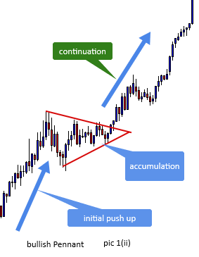
This is said to be the most universal technical trading tool on the landscape of financial markets. The Fibonacci indicator is based on Leonardo Fibonacci’s mathematical theory, which suggests that a certain key number sequences create ratios that repeat themselves in most facets of life; in this case, we would be looking at how the forex market reacts around Fibonacci numbers.

The Fibonacci sequence is a series of numbers where the subsequent number is the sum of the two preceding numbers.

Example: 0, 1, 1, 2, 3, 5, 8, 13, 21, 34, 55, 89.

The ratios are created by picking any of the numbers further down the series and dividing by the subsequent numbers that follow

Example: let’s pick 8

               Divided by 13 = 0.618

                                   21 = 0.382

                                   34 = 0.236

While you can go on and on, the Fibonacci ratios that are relevant to us in technical trading are as follows:


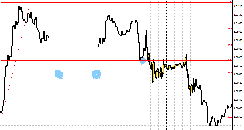
0.236, 0.382, 0.500, 0.618, 0.764 (Fibonacci retracement levels)

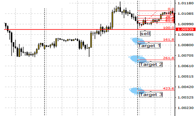
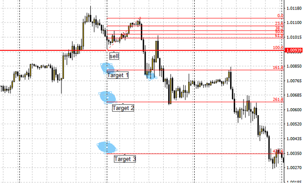
0, 0.382, 0.618, 1.000, 1.382, 1,618 (Fibonacci extension levels)

It is not at all necessary to memorize these levels as you have them already programmed in most trading platforms. In MT4, it is readily available on the toolbar, as discussed earlier.

HOW TO USE THE FIBONACCI TOOLS

REtracements

The Fibonacci retracements are plotted across two points in the market, usually a high and a low or vice versa. The point of this is to plot key areas that are determined by the Fibonacci ratios where the price is likely to reverse back in the direction of the initial trend.

The above picture shows the Fibonacci retracement tool plotted on the USD CHF currency pair. The tool was plotted on the initial price move upwards from the 100 point (bottom) on the Fibonacci tool to the 0 point (top).

You can see the price bounce on the retracement level of 61.8%. It is quite common to see the price make reactions at Fibonacci levels, but it is not always the case so it is better to use the Fibonacci retracements in line with other technical tools, such as the support and resistance and moving averages.

Extensions

The major difference here is that the Fibonacci extensions are largely used as a forecasting tool to predict the extent to which a currency pair price would move, thereby providing target areas for open trades and predicting the extent to which a retracement is likely to go.

The above pictures display an example of Fibonacci extensions used as a predictive tool to predict future price movement.

The extension as depicted above is used by placing the tool at a price point in the market and dragging to another point; in the case of a downtrend extension, the bottom is the 100 point on the tool and the top is the 0 point, while the opposite is attainable in the case of an uptrend.

As shown in the later picture above, you can take advantage of the Fibonacci extensions by entering a trade at the break of the 100 level and taking profits at each one of the extension levels.